 This post is a brief visual intermezzo before Tomislav takes you back to the more substantial matters of gameplay in Unity of Command. For those of you visually inclined or generally interested in game development, I’ll try to cast some light on the UoC graphics production process. We’ll peek into how the UoC cover artwork was made.
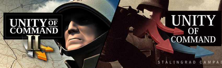
Picture on the left is our finished cover design. The starting idea was to make cover that is looking videogamey but with strong hint of a historical WW2 photo. So the main challenge was to recreate that WW2-ish atmosphere.
The artwork consists mostly of 3D rendered imagery composed together using an image editing program. But let’s start from the beginning…
Sketches and concept
I usually start off by doing a bunch of very quick and rough pencil sketches. At the same time I research a lot of relevant visual references, in this case – original WW2 period photos. These initial sketches are never intended as final designs. I just explore around visual possibilities of the theme without much thinking.

After that I made more focused thumbnails, grayscale with color accents. Again, a fairly large number of them done quickly. They help me see what works best in terms of composition and design. This time I’m taking into account the logo placement and I’m thinking of sketches as being draft layouts for the actual cover. Usually one of the thumbnails, the one with the most “zing”, ends up as a candidate for the final design. From here I proceed and refine the sketch until it’s articulate enough to serve as a starting point and a reference for the production of the final artwork.

Choosing the final motive
The dominant motive that came out of the prototyping process was a german panzergrenadier soldier in winter jacket. I thought it was the coolest of the lot and strongly iconic at the same time. Winter outfit perfectly fits the eastern front theme. I opted for the side view close-up for it exudes some nice heraldic qualities, quite suitable for the strategy game.
Artwork production
First step in production was making of soldier and tank models in a 3D package. They were built as low-resolution polygonal meshes. Additional details such as cloth folds and fur were added via displacement texture mapping. On top of that, I made a basic animation rig for the soldier model. This way it’s easily manipulated into various poses.

Several tanks and pzgrenadiers were then combined into the scene, lit and rendered out in high resolution. Image is afterwards post-processed for the final “sepia effect” of the old photo. Part of this image will be used as the background layer on our cover.

Detailing the foreground motive
Some more detailing was needed for the main motive; soldier head and the helmet. This was done through additional poly model tweaking as well as by adding high resolution texture maps for the face. I wanted the head to look iconic, monumental and instantly recognizable as a WW2 German soldier, altogether having a dark undertone of nazi heroic-realist art (credit will). The head was lit using hdr image for skylight effect with addition of two other light sources to create a dramatic and a bit otherworldly atmosphere with deep, obscuring shadows.

Logo design
Our typographic UoC logo needed some juicing up for the cover. I decided to give it more dynamism by throwing in some action arrows. They’d clearly suggest that this is a strategy game. Admittedly, arrows of all kinds are a bit overused in general. That’s why I went for curved 3d rendition having a distinctive elegant quality. UoC’s gameplay is rather fast and flowy and this is very well reflected in the look of the arrows.

Putting it all together
Finally, all these element were brought together into an image editing application. There, each layer was color-corrected and additionally adjusted to blend into the whole. Everything was composed over a spacious stormy sky backdrop to suggest the atmosphere of tension and anticipation. Operational map was added in the lower third of the image for even more “strategic” feel. The map also has a rugged barbed wire quality which fits well with the rest of the image.
And voila – finished Unity of Command front cover artwork.

8 Responses to Making of: Unity of Command front cover